A Cultural Center steps into its own identity : Rebranding Centre culturel d’Herstal
CLIENT WORKFrom under the city’s shadow to a voice of its own: we rebranded a Belgian cultural center around a single, powerful symbol : its door, open to all.
The Challenge
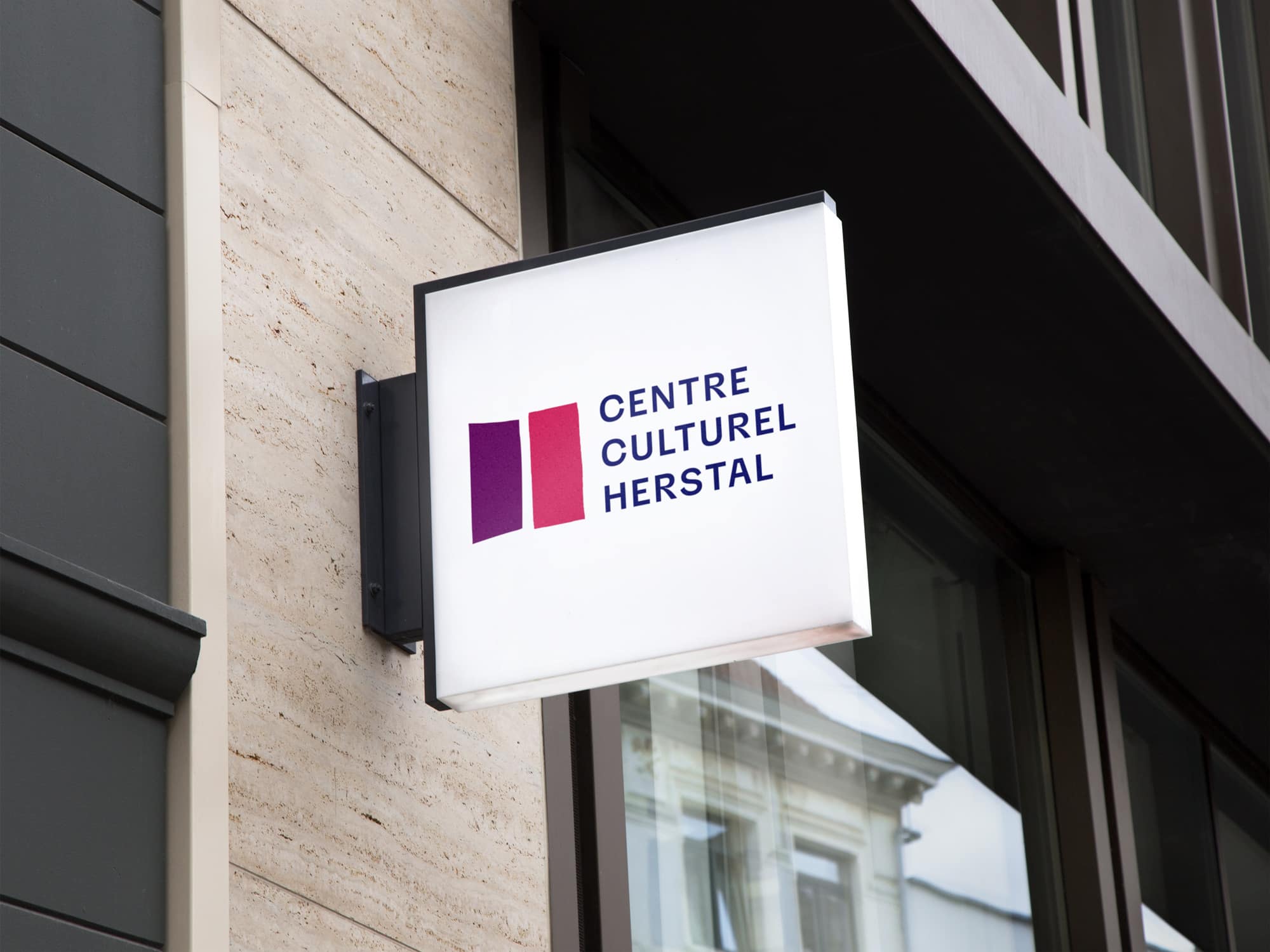
For years, Centre Culturel d’Herstal lived under the visual codes of its host city. The logo dated back to the ols days and borrowed heavily from the Ville de Herstal’s identity (especially the H). It was functional, but a barrier to the center’s own voice. The team wanted something that belonged to them: an identity that reflected what happens inside the building, not the institution next to it.
We started with what the team had been doing instinctively for years: drawing the building’s facade in fine lines across their communications. That instinct was right : the architecture meant something to the people who worked there. We took it further. We vectorized the building’s door and made it the heart of the new identity. A door is an invitation; a cultural center is a threshold. The logo became a quiet but persistent gesture: step in.
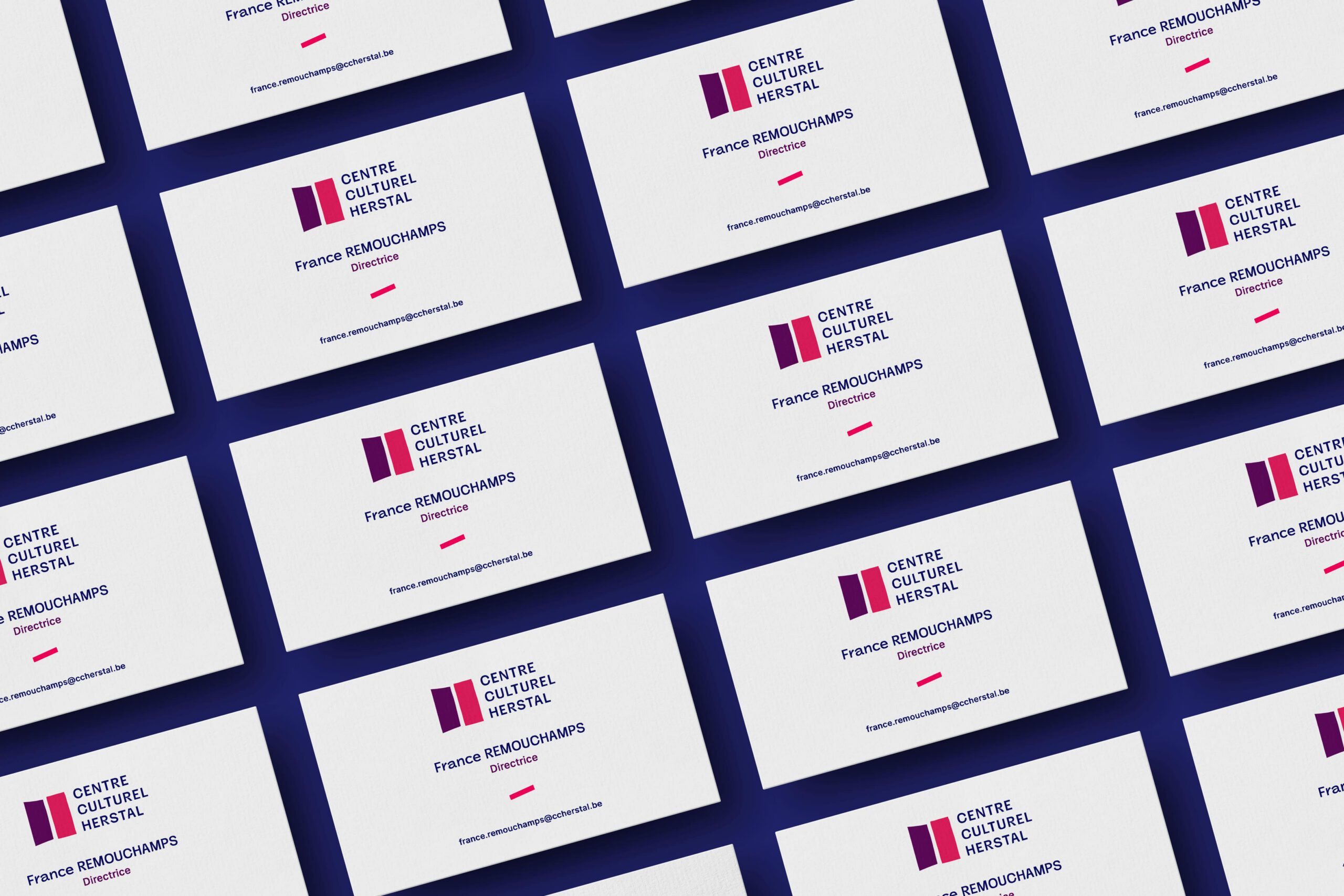
Around that symbol, we built a more vibrant palette, a magenta-to-deep-blue gradient that pulled the brand out of its institutional past and into something warmer, closer to the energy of its programs. The whole system was designed to be lived in by the team, not just delivered to them: a toolkit they could use independently, across seasons and years to come.
The storytelling: the door as an invitation to culture
By asking the right questions, we were able to lift a single element from their existing communication and turn it into a real statement. A symbol that says (almost claims) in one shape what a cultural center is: a place that opens, welcomes, lets people in. Pushing this door is exactly what the team offers every day: encounters, discoveries, a curiosity finding its answer.
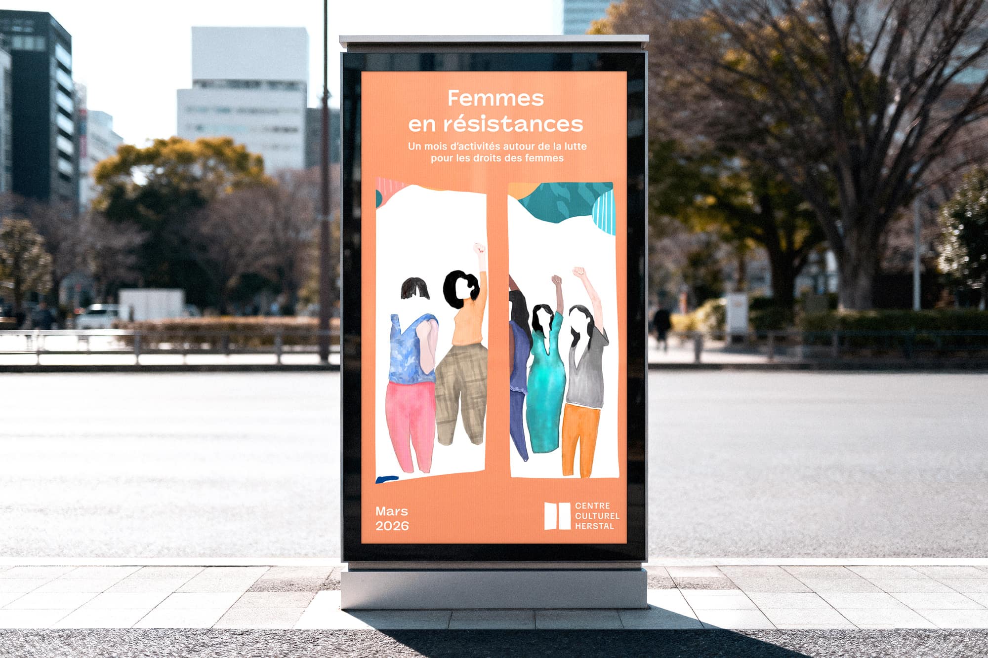
From institutional to alive
Vivid colors replaces the muted institutional tones, giving the brand the warmth and energy of the programs it hosts.
The palet is now between peach, magenta and deep purple. The colors are now synonym of action and dynamism.
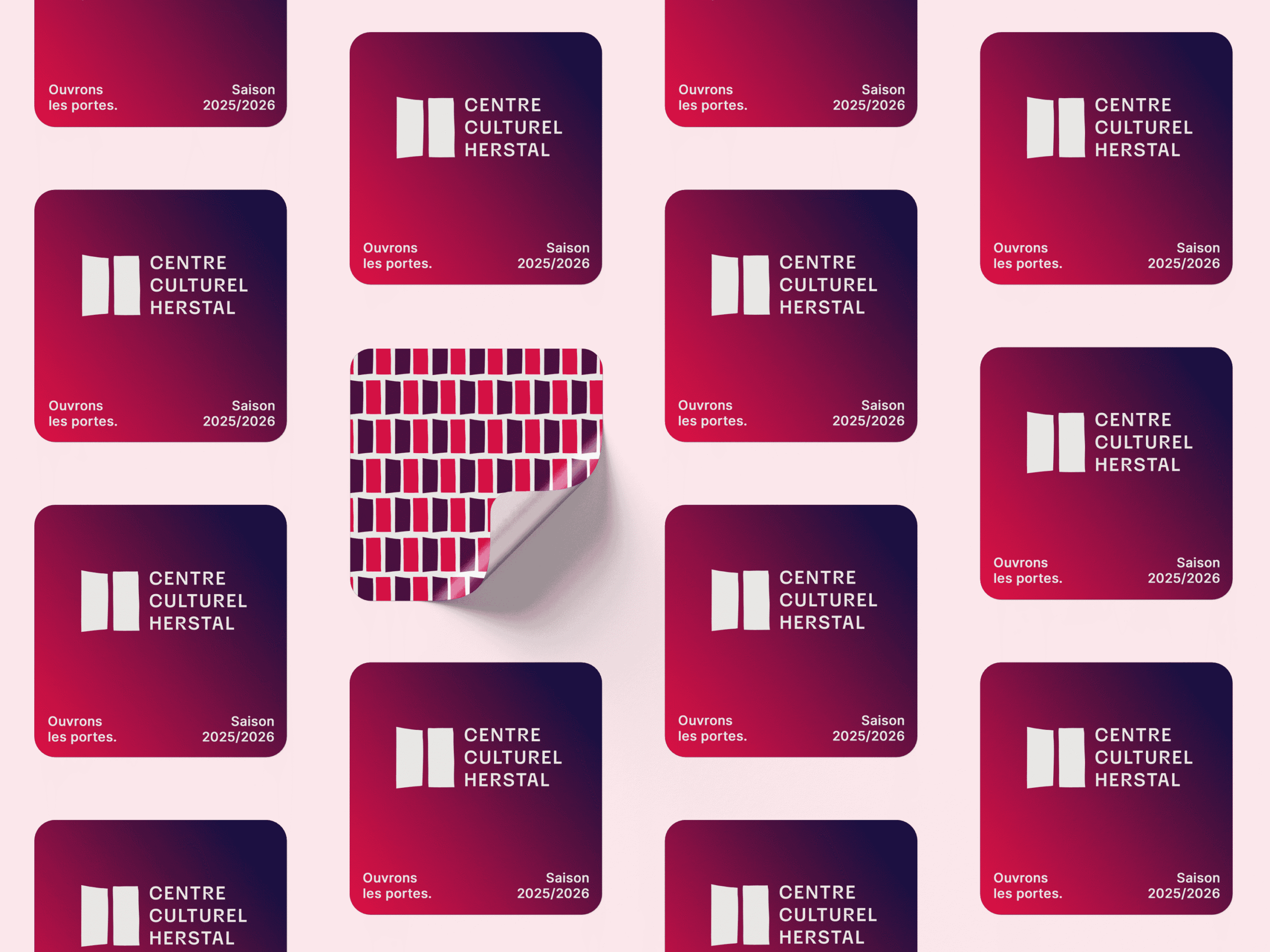
A toolkit built for autonomy
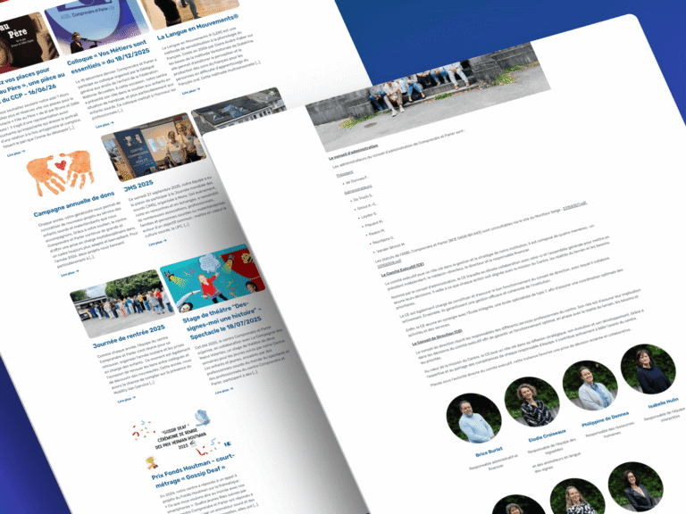
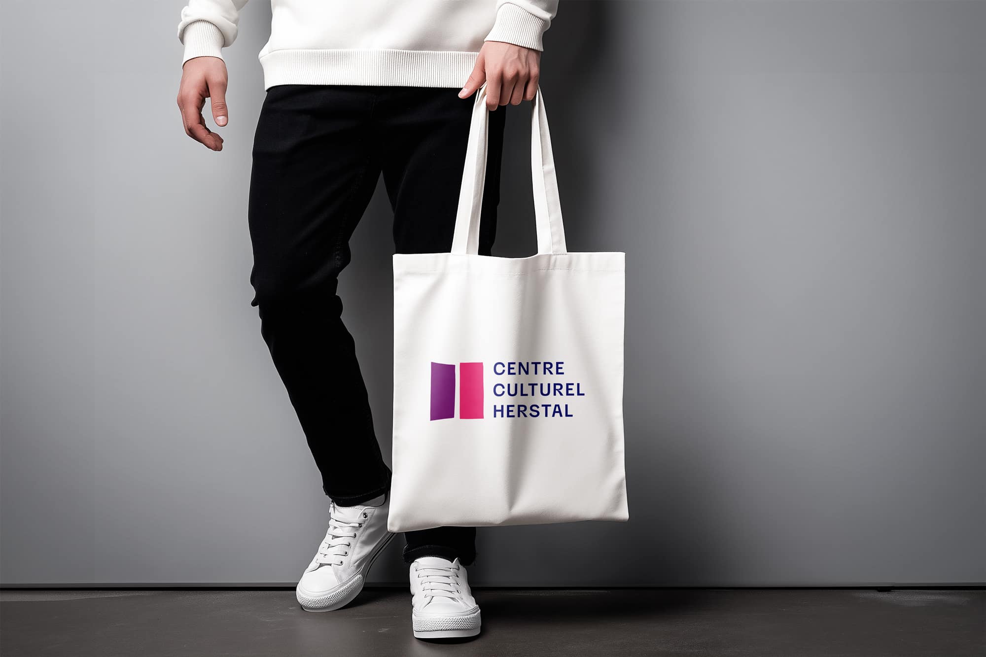
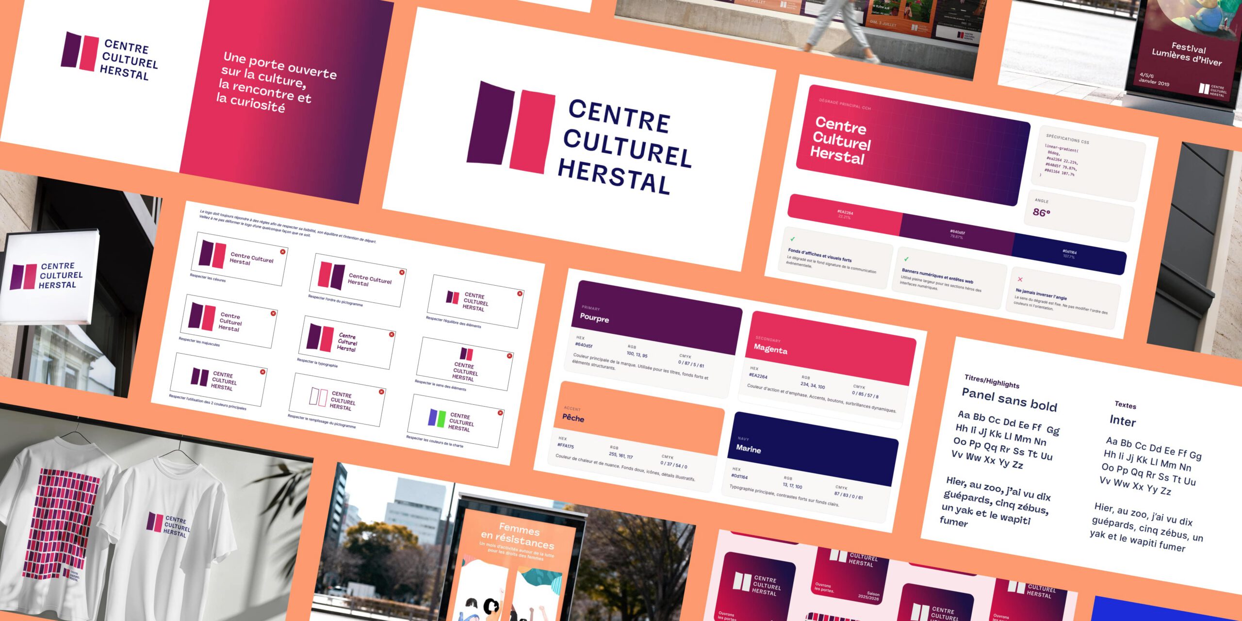
As usual, we delivered a complete identity system with typography, color, layout principles, applications. All designed so the team can produce its own communication independently.
The Feedback
The professionalism and expertise demonstrated by the team were unparalleled, and we couldn’t be more pleased with the results. We’ve been able to achieve new levels of innovation and success in our industry.